Monday, February 27, 2017

2/27/2017 - The Second Obstruction: Flip Flop House

       What is never present is always possible. What is one thing is not the other. Yes. No. Opposites attract. Like repel each other. All of these: in complete balance. The present problem is intended to articulate the dialectical condition of things. To understand them as one rather than another. And to question: what happens if we understand them as "another" (an/other) rather than as "one"?
       For the "Flip Flop House," you are to take a list of 10 descriptive statements or adjectives of the original precedent and "invert them." From this, you will use 5. They should be the most diverse in nature and most closely tied to what you think are the initial "design decisions" of the original precedent or the most important. So, for example," above ground" becomes "underground"; "transparent" becomes "opaque"; "pilotis" become "load bearing walls", "horizontal windows" become "punched out windows," the "horizontality of the project" becomes the "verticality of the project," etc. 


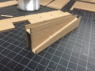
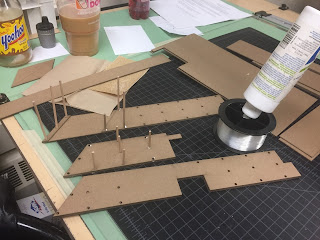
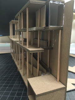
       The first flip I chose was Open/Close Walls, my building was originally enclosed on 2.5 sides so I flipped it so the opposites walls are enclosed and the previously enclosed walls are now open. The second flip, was to place my building underground, but still keeping the open sides; I allowed an 8 foot gap between the walls of my building and the earth walls. The third flip that I choose to do was to flip the floors, so that the fourth floor is now the bottom and the bottom floor is now the top. The fourth flip that I did was to squish the building. It had four floors and and was relatively taller than it was wide. So I wanted to squish it down a little to compact the floors. The last flip I choose, going off of one of the comments of my last crit, to get rid of the grid and to place the columns randomly. We had to make a series of models representing the changes that we choose to do to our buildings. I'll attach pictures below.

Flip One: Open/Close Walls

Flip Two: Under GroundFlip Three: Flip Floors

Flip Four: Squish

Flip Five: No Grid

Friday, February 24, 2017

2/24/2017 - Final of The Thin

       The final crit form the first obstruction was on Tuesday, so my apologies for taking so long to get back to you. Over all I think the crit went fairly well. Our guest critics were Mr. Garrett House, a previous student of Professor Carranza, who took this class the last time he did the 5 Obstructions. The second was Professor Gail Fenske, a teacher here at RWU, I actually had her for a class last semester. I was the last to present. I started with how my building transformed form the original, then moved on to a walk though of the floors.
        The first comment that they said was that it was a very believable and convincing as a project as a whole. The gird of columns was a little strong and that I should think about removing some, especially on the third floor to open up the kitchen dining and living areas. or maybe slimming them down a little. also to darken up my drawings a little and twist the pencil more. Then the crit was over. I don't if its a good thing to a bad thing they didn't have that much to say, but if they just want to talk about my drawing needing to be darker vs, my project sucks and its not understandable at all, I'm okay with that.


Saturday, February 18, 2017

2/18/2017 - Finalizing

       First I just want to say sorry for not blogging on scheduled but Thursday night and Friday were quite stressful. Something personal from back home, nothing with studio work.
       So sense the last time we talked, I finalized the plans and sections, fixing the stairs and adding in the few things I missed. When redesigning the fourth floor, I was able to expose all the columns by incorporating some curves that the original plans had. When laying out how the final sheets would look, I saw that it was kinda awkward to spit 8 drawing in-between 3 sheets of paper. After talking with Professor Carranza, he suggested an interior section axon-o-metric drawing, I wanted to show the main living floor, the living room, dining room and kitchen and how that floor is completely open. Now, I've never drawn one before (I'm a transfer so I never learned how) so I tired it out, took a few tries, but I think I got it right and I think it looks pretty good if I do say so myself.
       Another new thing for me, this is the first project that I used the laser cutter for my model. I cut it out Friday night and what that machine did in 10 minutes would have taken me a day to do, which really helped out and made the model a lot easier to put together. Especially with the columns, instead of cutting out all the little circles, just poking them out after they were cut with the laser, so amazing!!  I'll add pictures underneath of the model making. So all I have left to do for this project is to put my drawings on the fancy paper, Bristol board, and the booklets.


Tuesday, February 14, 2017

2/14/2017 - Narrowing in on the Thin

       Happy Valentine's Day!!
       Over the weekend I took out half of the columns on my plans, which really opened up the courtyard and the third floor living spaces. I reduced the height of the floors form 16' to 10', this also shortened up the ramps and the stairs, allowing for more room for the bottom courtyard. After redrawing the sections, I am much happier with the design. I also redesigned my top floor to have two open to below spaces, one over the living area and one over the dining area. But I still need to work on that floor a little more. I have more than half the columns buried in walls and I want to shift the walls so that the columns are showing. In doing so it will change a few things on the long sections, but nothing that an eraser can't fix. It wont change so much to were redrawing them is necessary. I also have to revisit almost all the plans, after drawing the sections, I've found a few things that I missed. Also when I changes the height, the stairs changed so I have to fix that as well.
       For this variation, Professor Carranza wants us to layout our presentations like Enric Miralles. When he was showing us some of his work, I found them very confusing and I didn't like them. But they might end up like Le Corbusier's work. Confusing at first but I might realize once I get into it that it makes perfect sense and wonder why everybody doesn't do all their plans like that. Maybe. I'll attach some of his works below.


Friday, February 10, 2017

2/10/2017 - First Go

       This week we worked on schemes and floor plans for our "Thin" houses. After a few layouts, I decided to make my house 14' wide. I kept the program the same and on the original floors that they were on. The first and second were kept open, housing just the garage, mechanical space, clinic and stair up to the main house. The third floor, which I started laying things out on this floor, because I think of it as the main floor, holds the kitchen, dining and living rooms and the roof terrace. The fourth floor holds the three bedrooms and only one of the bathrooms.
       Moving onto the sections, I started with the two in the short directions. I chose to double the floor to ceiling height and make it 16' tall. After I had them drawn, I took a step back and took out my tape measure and planed out the size of the bedrooms and found out that 16' tall is too much, especially in the courtyard that is 2 stories tall. Also I doubled up the columns, but that is too much as well so I'm going to try again and find a happy medium. Professor Carranza also helped me figure out another layout for my top floor  to get an open to below space and maybe get that second bedroom up there.


Tuesday, February 7, 2017

2/7/2017 - The First Obstruction: Slim(Fast) House

There's no mystery to it. Through this you will be able to take an existing precedent and run it through a "replace. combine, and sensible design" approach to reach your goal. A personalized system and the 3 keys to the Slim(Fast) plan work hand in hand to achieve ever so slender buildings:

  • Replace the traditional notion of the architecture for a thin one: Consider the qualities of the traditional architecture (such as its programmatic requirements, forms, sequence of space/movement, edge/thresholds, structure, wall openings, etc.) and how these should or could work within a thinner form.
  • Combine these elements into lean ones: Rethink these elements to deal primarily with the tension between long walls, spaces, sequences, movement, how light enters, etc. and short ones. Rethink the notion of inhabitation so that the body so that the body is encased by these slender forms and traverse these long spaces. Combine these elements within  the logic of the traditional architecture. Consider their organization as one where the linear and slender predominates (ie. enfilade, parallel, sliding, delaminated, etc.)
  • Sensibly design so that the existing forms or formal strategies, compositional systems, and general organizational strategies remain but the building is "ever so slender": Compose the structure so that it becomes a slimmer version of the first.

       After receiving this project I started to think about what a "thin" building would look like. If it would look thin on the exterior or if it would feel thin as someone is walking through and experiencing the architecture. And I thought of doing both, so it looks thin and feels thin, which I found out are two separate things, one can look thin but feel spacious inside, or vise versa. For class we had to come up with 3 schemes of how to intemperate how to turn our buildings into thin ones. 
        My first idea is to double the height of the floor to ceiling. To double the height of the columns to draw attention to the height and to make it at tall space and the columns to help give the feel of being "thin".
       My second it to pull apart the rooms, make them longer and connect them with long hallway. By doing so, opening up spaces to have more trees, the tree I feel accentuated the vertical more than the columns do. 
       My last idea was more of a combination of small things, taking the stairs form a double run, into a single run. Taking the fun U-turn form the kitchen to the dinning room and pull it making the hallways longer, Taking the brise-soleil's and adding more vertical elements, so the openings aren't horizontal but vertical and thin. Enclosing the ramps, adding walls on either side up to the ceiling to feel tall the thin as one it traveling through them. Adding twice as many columns to the roof terrace to give the feel of tall and thin. 

       After showing Professor Carranza what we had (we split up into 3 groups and showed him our works) he looked disappointed. He said "GO CRAZY!!" to push things to the limits. How thin can I make this? To push things to the limit then push things some more. So I'm going to take my ideas and pull them as thin as I can then pull some more. 


Friday, February 3, 2017

2/3/2017 - A Full Understanding

        Today we showed the booklets we made for studio (I'll attach pictures at the bottom). I'm really happy how mine came out, and that no one else had the same idea as me. The booklet I made was simple, 6 pages. What I really wanted to show about the Maison Curutchet was the tree, the open spaces, open to below, and how Le Corbusier connected the house to the tree, he used wooden tiles for the flooring, wooden handrails and trim. He had a few splashes of color in the trim to some windows, but other than that, the rest was kept white.
        I found a quote that I think best describes the Maison Curutchet.
         "It is one of the mist beautiful, specially dramatic and poetic houses designed by Le Corbusier" - Alejandro Lapunzina
        The reason I think the Masion Curutchet isn't that well known is because in less then a decade after it was completed it was abandoned. Le Corbusier recommended the local architect Amancio Williams to build the home. He started the job and tried to keep it as original to the plans as possible. Sometime during the construction process something happened and he left the job, and Simon Ungar took over. He was a local contractor, and he changed a lot of things on the project, without consent of Dr. Curutchet. Some of the things he changed were the wall heights, Dr. Curutchet hated the finished project, and was the reason he abandoned it. Another reason, I think, is because all the main characters of the home have died. Dr. Curutchet died in 1992, Amancio Williams died 1989, and Le Corbusier died in 1965. 
        In 1988 the Maison Curutchet was fully restored and declared a National Monument and Dr. Curutchet's family still owns the building, but no one lives in it, and people are welcome to visit and walk though, even though it's empty. 

Model


Booklet


Drawings


First Floor

Second Floor

Third Floor

 Fourth Floor

Section


Wednesday, February 1, 2017

2/1/2017 - A Deeper Look

       Over the weekend I cut a section through the floor plans an built a small model of the Maison Curutchet. The section really helped me understand the connection, or disconnect, the clinic has with the home.
       The model really enlightened me on all the open spaces of the Maison Curutchet, I would say that half of the house is outside. the first two floors just consist of the clinic with the apartment attached, the garage, and the stairs to get up to the house.
       When I was cutting the section there were a few rough patches that were confusing to see how it would fit together. mostly the stair and how they fit with the ramp and the change of the levels. I was able to look up some reference pictures of the home, and a few videos helped me understand. I'll attach a video of a walk through and some images that helped me understand the layout and workings of the home. I'll upload some images of the model and plans I have. On Friday I will have the booklet done for Maison Curutchet, I'll upload that as well.


Casa Curutchet